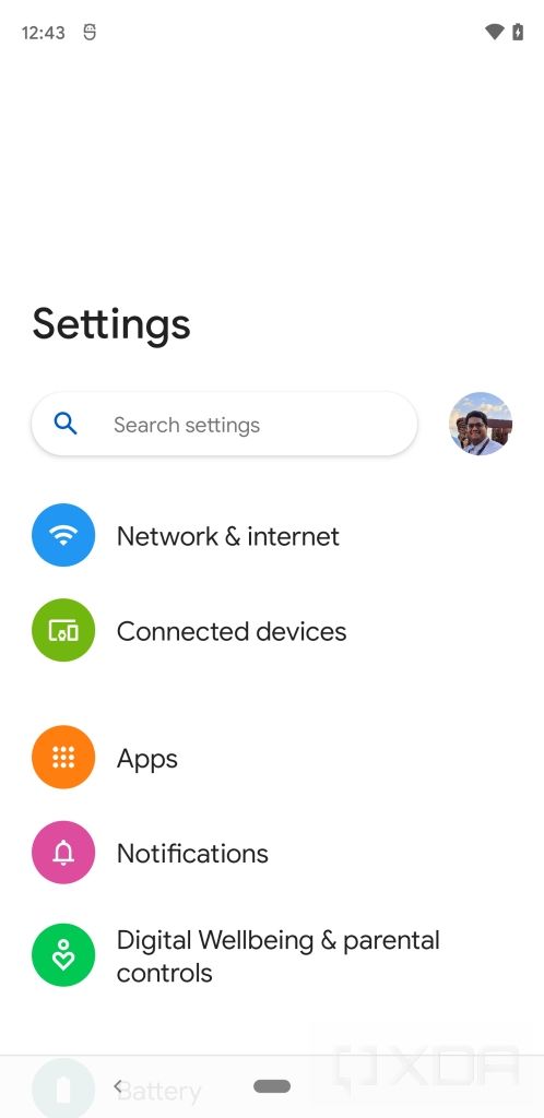
Google just started rolling out the first Android 12 developer preview, and it includes a couple of UI changes that make the OS easier to use one-handed. These changes are not to be confused with the one-handed mode we talked about earlier this week, as they only bring some of the UI elements closer to the bottom of the display instead of shrinking the entire screen.
As you can see in the attached screenshots, the updated settings UI in the Android 12 developer preview features a new shorter Search bar that has been moved down closer to the bottom of the display for easier one-handed access. Although this may not seem like much, it’s still better than the older settings UI with the Search bar at the top of the page.


If you aren’t impressed by this subtle change, then you’d be glad to know that the Android 12 developer preview includes another neat trick up its sleeve. The release features a new feature flag called “silky home”, enabling which makes the UI even more one-handed friendly. Here are a couple of screenshots showcasing what the settings look like with the feature flag enabled:


Android 12 settings with the silky home feature flag enabled
Although this new UI looks a bit of a One UI knockoff, it’s still great to see Google introducing changes to make Android easier to use one-handed. With phones getting larger by the day, subtle changes like this are a welcome addition, and they can go a long way in making stock Android more pleasant to use. However, if you’re not satisfied with this implementation, it’s worth noting that Google has been developing a separate one-handed mode feature for inclusion into AOSP and, based on what we know about it so far, it may make one-handed use even easier.
The post Android 12 brings UI optimizations for easier one-handed use appeared first on xda-developers.
from xda-developers https://ift.tt/3u9VHp6
via IFTTT

Aucun commentaire:
Enregistrer un commentaire